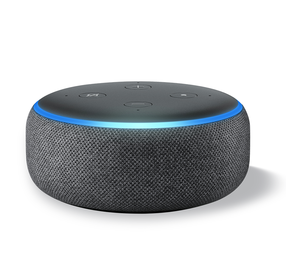
Currently, there are natural limitations to voice interactions, some of which will be solved by advances in speech-to-text recognition, natural language processing and AI. If you have a clear understanding of what is possible and design your voice assistant within the boundaries of those limitations, your user will have a more rewarding experience.
Voicing the challenge
While developing a project, one can often focus on just the technical aspects. However, the functions and methods are only one piece of the puzzle and we can neglect the need for a well-designed base, forgetting about the needs of the end user. Designing for voice presents a completely different set of issues for people who usually create apps and websites as there are various ways of interfacing with a visual display.
Voice only has audio input and output, with no visual cues to prompt or guide the user, so we need to change our way of thinking when working within this medium.

The 10 Key Points
Recently, I was fortunate enough to visit the 2018 Tech Open Air conference in Berlin where I attended one of the many satellite events hosted by local companies dotted around the city. This event, hosted by a company called Onsei, with the title "Designing world-class Voice Interfaces with Amazon Alexa & Google Assistant" particularly piqued my interest since I was also creating voice assisted apps. It was a simple presentation outlining ten key points to adhere to when designing for voice, points that had been discovered by trial and error whilst creating voice apps for Alexa and Google Assistant. This resonated with me as I had come to a similar understanding when designing prototype Alexa skills for a few of our clients - and much of this also crosses into the design patterns for chatbots. What do you think of these points?
Point 1.
Don't try and replicate your site or app
This is true for any service such as a chatbot or voice assistant - it should do a limited set of tasks that compliment your offering, and it should do them well.
Point 2.
Why have a voice assistant?
Does your voice assistant provide added value to your product or is it just a something to tick the box? “Hey we’ve got an Alexa Skill!”.
Point3.
Help the user understand the scope of the voice assistant
With no visual clues (except perhaps the “I’m waiting…” lights), the user will need guidance and constant feedback about what they can do next in the conversation. There should be a clear, short path to success when using your voice service because an open-ended conversation is not the goal here.
Point4.
Limit the response information
Brevity is the keyword, not verbosity. Hearing Alexa speak for too long is distracting and a bit annoying. Tip: don’t ask Alexa to read out your terms-and-conditions. Both Alexa and Google Assistant have an app where additional information can be sent via “cards”. Or perhaps consider emailing detailed responses directly to the user?
Point 5.
Test with users
You are not the user, your client is not the user. You are both too close the project and this will cause you to lose perspective. Have “real” people test your voice service, so you can better manage scenarios that will happen in the wild.
Point 6.
Listen to users
Let the clients hear what the users expect from the brand and update the service accordingly based on the feedback given.
Point 7.
Design is just as important as the technology
It doesn’t matter how clever your backend is at pulling data and collating information if the user can’t access it. As intimated at the start of this post, you need to work on the user journey not just the output.
Point 8.
What about hybrid interfaces?
Although I have been saying that there are no visual cues, with the release of devices such as Amazon Echo Spot and Show, you may need to consider accounting for displays with visual feedback and touch capabilities. Allowing your responses to include “cards” as well as vocal output can help future proof your service.
Point 9.
Handle errors gracefully
“An error has occurred” is not the right message to give a user. Your voice assistant will not be infallible, whether it’s a request that isn’t handled or a failure in the server, but you can capture and present the errors in a friendly way that doesn’t end the journey abruptly. Also, have a way for people to make contact with you.
Point 10.
Make it human
No, this doesn’t mean create a sassy AI. It means be as human as you can i.e. think like a human when creating feedback. Vary the responses so the same information is delivered in several different ways - humans notice, and appreciate variance and it helps keep the engagements fresh and interesting.
These points are more than just recommendations, and following them will make your product shine. Additionally, for the purpose of this post, I would like to add one more point:
Point 11.
Handle your client's expectations up front.
This can be a tricky one as you want to please as much as you can, but there are just some things that can't, or shouldn't, be handled by voice. You need to be able to balance what can be done technically with user experience - it doesn't take much for a person to become frustrated with a robot that doesn't understand them.
