Branding Britain's largest housing association
2016 saw the historic merger of Affinity Sutton and Circle Housing, two of the UK’s leading providers of affordable homes. The Group is now made up of three distinct but connected divisions - a housing association managing over 125,000 homes, a charitable foundation, and a private development company. It was our job to create entirely new brand identities for the Group and its constituent parts.
Do you have a similar challenge?
Please get in touch to start a conversation about how our expertise can help your business thrive.

A clarion call
Our new name for the Group - Clarion - is inspired by the leading position our client holds in the industry. The word comes from a loud, clear trumpet used in medieval warfare - so the ‘clarion call’ is an unambiguous message which commands action.
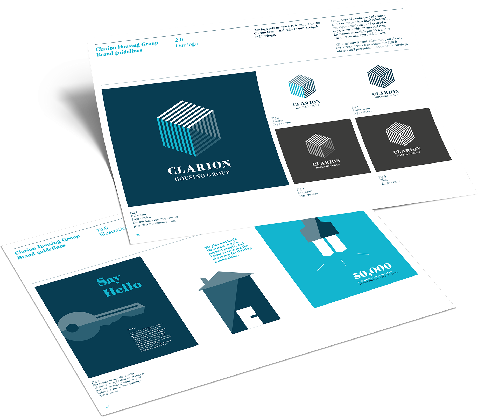
We developed the initial strategic positioning, created a distinctive visual identity and delivered a comprehensive set of brand guidelines.
All in the family
Multiple brands within an umbrella group need to be distinct but related, like members of a family. The three elements which make up the Clarion Group are very different in purpose, yet united by common values. We used a connected approach, ensuring the three brands worked both individually and collectively.

From the past, to the future
The Group’s commercial wing is breaking new ground by working in partnership to achieve successful housing projects. We took inspiration from a 19th century engineer, Lewis Howard Latimer, an important working partner to both Thomas Edison and Alexander Graham Bell. Latimer - the Group’s commercial brand - was born.

For the common good
Social purpose is key to the Clarion Group, and at the core is a charitable foundation, Clarion Futures. We’ve developed this brand alongside the housing association and commercial wings of the organisation, creating a unified identity to reflect shared purpose and values.
A connected brand
Equator identified the benefits of a connected approach in creating the three brands, then delivered the visual assets to ensure they worked together and individually. Each now has a clear graphic language, ensuring a distinct message and personality across the full range of communication channels.
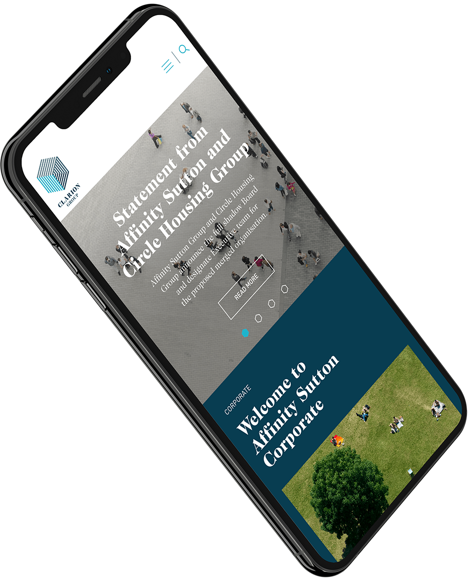
Our role extended into website and digital, environment and office interiors, staff communications and more.
Clarion is a complex organisation performing a variety of different roles. We created a family of brands which make the distinctions clear while uniting the Group in common messaging, purpose and character.

The Clarion Group is sole landlord to over 125,000 households. In a recent survey 71% of residents expressed trust and confidence in Clarion - a significant increase against pre-rebrand figures.
