Not just bread and butter
Tesco Bank is a challenger to the big high-street names, benefiting from the parent supermarket’s credentials and down-to-earth, trustworthy personality. We’ve helped the bank achieve some impressive results on a number of brand-defining projects.
Are you facing similar challenges?
For TescoBank, we didn’t just redesign a website and smooth a few application journeys - we transformed a brand. Find out what we could do for you.
A credit card in half the time
When TescoBank asked us to bring their credit-card application process up to date, we used learnings from earlier quote-and-buy projects to build a user-friendly, intuitive journey. We halved the number of steps required to apply, and introduced a progress bar so customers knew how long the process would take. The conversion rate is up by 13%, and Google named the new application process Best in Class.

"The site had lost it’s way, we streamlined content, ditched material and built an online community"
A smoother ride for car insurance
TescoBank’s car insurance application journey took 13 whole pages when they brought it to us. We cut it down to four, reducing the time it takes to apply by around 40%. We also changed drop-downs to buttons on the site, and made the quote ‘sticky’ on mobile devices to cut down the need to scroll. Applications are up by 8%.

A complete transformation to build a ‘proper’ bank
We redesigned TescoBank.com's pre-login website from scratch, aligning the online experience with the Bank’s positioning while developing the brand online. The old site had lost its way. It didn’t reflect TescoBank’s brand personality or values, and it wasn’t particularly user-friendly. Worse still, it offered a journey based on the product rather than need.
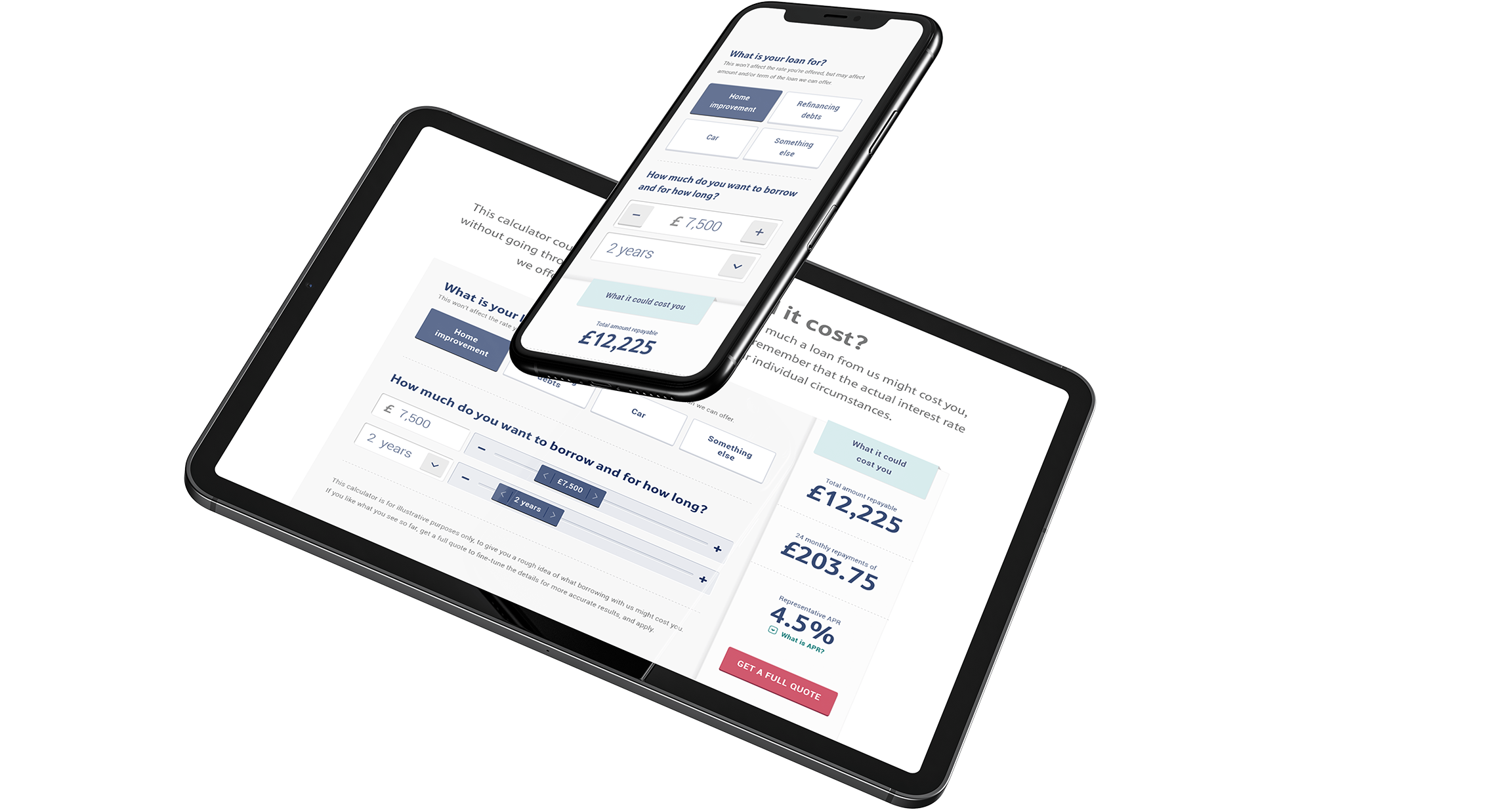
We created a whole suite of tools and calculators so customers could compare and check rates, terms, costs, and benefits in seconds. We streamlined content, ditching a huge amount of non-user-focussed material generated to drive SEO, and built an online community by gameifying interaction and inviting user-generated content.
The foundations of a true contender
The credit card and car insurance application processes have radically improved UX and conversion, while the new site is a disruptive presence in a sector facing significant challenges. Converging with the launch of a current account, the website helped position TescoBank as ‘a proper bank’ in the public imagination.
Applications for savings and credit cards up 19%

